

Kitchen front colours 2026 — what's trendy, what's timeless, and what will pass in a year
The colour of the fronts is a decision you will live with for 15–20 years. And that is exactly why it is worth approaching it differently from choosing a wall colour — which you can repaint over a weekend. You won't replace a kitchen front over a weekend.
At Furnipark we carry out over 200 kitchens a year. We see what customers choose, what they praise after a year and what — to put it plainly — they regret. In this article we share what we really know about kitchen front colours in 2026.
Trends 2026 — what is popular now
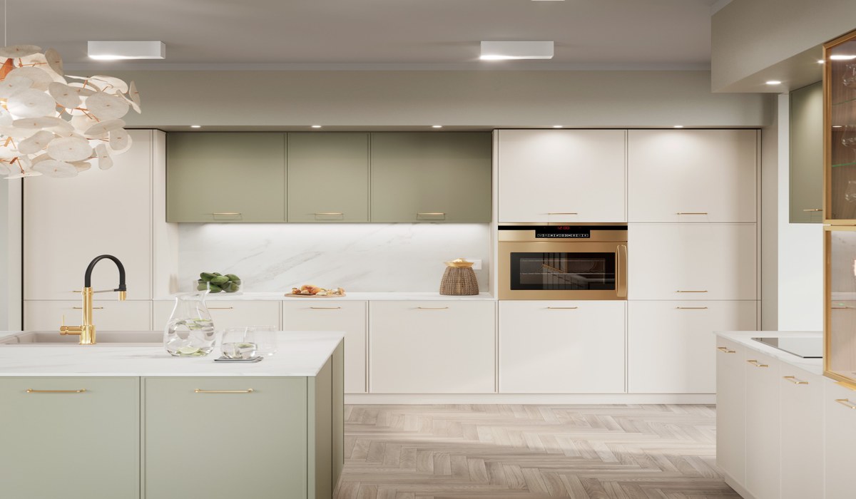
Bottle and forest green
One of the stronger trends of the last 2–3 years, which in 2026 is still at the top. A deep, saturated green (bottle, forest, olive) combines beautifully with a wood-effect worktop or quartz conglomerate in shades of beige and sandstone. It works especially well in kitchens open to the living room with plenty of natural light.
The risk: green is strong — in a small room without a window it can be overwhelming. Before deciding, be sure to test a sample in your own light (see the section below).
Anthracite and graphite
Dark greys remain very popular — and unlike deep black they give more flexibility in arrangement. Anthracite is easy to combine with stainless steel, concrete, wood and white walls. A more durable trend than black fronts — less extreme, but still expressive.
Beige, cream and earth colours
A return to warm, natural shades — inspired by Scandinavian minimalism and Japanese wabi-sabi. Light beige, creamy white, sand, a terracotta accent. These colours brighten a room very well and are much more timeless than strong trends.
Two-colour kitchens
The upper units in one colour, the lower ones in another — or the build in one colour and the island/peninsula in a contrasting one. A popular layout: white upper + dark lower, or a cream whole with a graphite island. It requires a good 3D design to assess the proportions before anything is produced.
What doesn't go out of fashion — timeless colours
Matt white
A classic that was never really a fashion — it has been a permanent feature of the market for several decades and there is no sign of this changing. Matt white brightens a room, is neutral to any change of wall or floor colour and doesn't date. If you have doubts about colour — matt white is a safe choice.
Neutral greys (light grey, warm grey)
Not to be confused with anthracite — we mean light, calm greys that have been at the forefront of customers' choices for 10 years. Easy to arrange, they don't force a particular aesthetic, they suit almost any decor.
Wood-effect fronts (wood-structure laminate)
Technically speaking this is a pattern, not a colour — but it deserves a separate point. Fronts imitating wood (oak, walnut, pine) are timeless and fit the trend for natural materials. Combined with white or beige fronts they give a warm, cosy aesthetic.
What may pass in 2–3 years
An honest note — without scaremongering.
Very deep black
Black kitchens were at the peak of their popularity around 2021–2023. They are still chosen, but as a trend they are starting to saturate. Black is also a demanding material — fingerprints, dust and grease are very visible on it. More about dark kitchens: A dark kitchen — graphite, anthracite, black. Is it worth it? →
Blue (navy, cobalt)
It appeared strongly around 2020–2022 as the "new green". In 2026 it is chosen less often — which doesn't mean it is a bad choice, but it is past its peak of popularity.
Gloss as the dominant finish
For several years gloss was synonymous with modernity. Today matt is the preferred finish in the higher segment — and this tendency seems lasting, not temporary.
How to test a colour before ordering — and why it's essential
This is the most important practical piece of advice in this article.
The colour of a front looks different:
- On a computer screen (monitor calibration, colour space)
- On a 10×10 cm sample than on a whole wall of cabinets
- In daylight than under artificial light
- By a north-facing window than a south-facing one
- Against walls in a cool shade than against warm ones
What to do so you don't get the colour choice wrong:
- Ask for a sample — at Furnipark we send front samples by post. Look at the colour in your room, at different times of day.
- Place the sample next to the planned worktop (or its sample) — the front + worktop combination determines the overall impression.
- Look from a distance — a sample held in front of your eyes gives a different impression from a cabinet seen from 2 metres.
- Photos taken with a phone lie — the camera corrects the white balance. Judge colours with your own eyes, not through a lens.
How colour affects the sense of space
A few rules we check in every project:
- Light colours enlarge visually — white, cream, light grey "open up" the space. In a small kitchen (up to 8 m²) this is especially important.
- Dark colours make it cosy and dramatic — in a large kitchen with good lighting they work beautifully. In a small one without a window — they can overwhelm.
- Colour continuity with the living room — in an open kitchen the colour of the fronts should harmonise with the colour of the furniture and walls in the living room. A sudden contrast with no design sense reads as a mistake, not an intended effect.
- Upper cabinets in a light colour — even with dark lower ones — "lift" the ceiling visually. This is one of the reasons for the popularity of two-colour kitchens.
Our recommendations in 2026
| Situation | Recommendation |
|---|---|
| Small kitchen, little light | Matt white or light cream — visual enlargement is the priority |
| Large kitchen open to the living room | Bottle green, anthracite or two-colour — the space will carry an expressive colour |
| You don't know what you'll want in 10 years | Matt white or neutral grey — always current, always works with repainted walls |
| You want a kitchen for 20+ years | Avoid strong trendy colours — or use them only as an accent (island, front of one cabinet) |
| You want a "wow" effect | Dark green or anthracite + conglomerate worktop in beige/sandstone + wooden details |
The most common questions about front colours
Can I see how the chosen colour looks in my flat before ordering?
Yes — we send samples by post or welcome you to the factory in Elbląg. In the 3D design we show the chosen colour in the context of the whole kitchen and the size of your room.
Does matt or gloss hide fingerprints and marks better?
Matt — decidedly. Gloss collects every fingerprint and grease smear, which is especially visible on dark fronts. Matt is more forgiving in everyday use.
Does the colour of the fronts affect the price?
In the case of lacquered fronts — yes. Standard RAL colours from our palette are in the base price. Non-standard shades (outside the catalogue) may involve a surcharge and a longer lead time. With textured laminated fronts the colour as a rule doesn't differentiate the price.
How many colours do we have to choose from?
In lacquered fronts — several thousand shades from the RAL and NCS palettes. In textured laminates — dozens of patterns and colours from the current collection. We show samples at the meeting or send them by post.
See how the chosen colour looks in your kitchen — 3D design free of charge
Before you decide — see it. A free 3D design lets you compare several front colours in your specific room, with your lighting and layout of space.
Call: 608 517 844 — Mon–Fri 8:00–16:00
or write: kuchnie@furnipark.pl
Lacquered or laminated fronts — which to choose? →
A dark kitchen — graphite, anthracite, black. Is it worth it? →
Which kitchen worktop to choose? A comparison of materials →