


A dark kitchen — graphite, anthracite, black. Is it worth it and how to avoid mistakes
Dark kitchens make an impression — especially in photos. This is one of the reasons customers regularly come to us with inspirations cut from magazines or saved on their phone: deep black, elegant anthracite, warm graphite. And that is exactly why we have to say a few things these photos don't show.
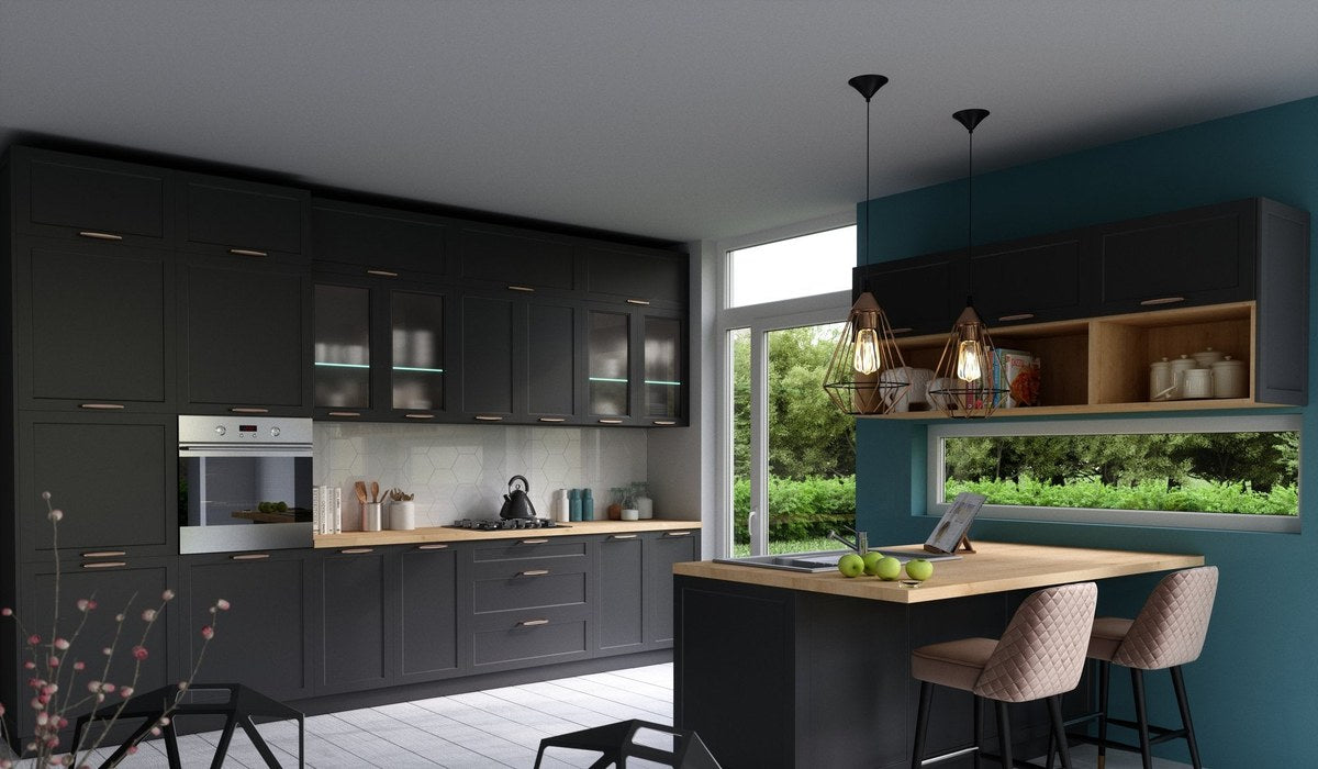
At Furnipark we have made many dark kitchens. Some customers are delighted after a few years. Some — regret it. The difference comes down to a few conditions that must be met for a dark kitchen to work in practice, and not just in a photo.
How do graphite, anthracite and black differ?
Before we get to the assessment — a few definitions, because customers often use these words interchangeably.
- Black — a deep, saturated colour with no admixtures. In kitchen fronts available as matt (more forgiving) and gloss (very demanding). Black tolerates no compromises in arrangement — either it works or it overwhelms.
- Anthracite — a dark grey with a slight cool or neutral shade. One of the most practical "dark" colours — less extreme than black, but still expressive. Easy to combine with stainless steel, concrete, wood.
- Graphite — a dark grey with a warmer or slightly brown undertone. Cosier than anthracite, less cold than black. Often used in combination with wooden elements or a worktop in a warm shade of beige.
When a dark kitchen really works
A large room with good access to daylight
This is condition number one. Dark fronts absorb light — in a large, bright room this effect is controlled and creates depth. In a small kitchen without a window or with a north-facing window — dark fronts make the room shrink visually and become gloomy.
The minimum rule: if your room is below 12 m², think very carefully about a dark kitchen. If below 8 m² without a large window — we advise against it.
Good artificial lighting (planned from the start)
A dark kitchen requires carefully planned task lighting — over the worktop, under the wall cabinets, inside the cabinets. Without it, dark fronts and a dark worktop create a zone in which you can't see what you are cooking. This is not an aesthetic problem — it is a practical one. More about lighting: LED lighting in a bespoke kitchen →
Contrast with a light worktop or wall
Dark fronts + dark worktop + dark wall = a cave. Dark fronts + a light worktop (white conglomerate, light concrete, wood-effect) + a light wall = elegance. Contrast is crucial for a dark kitchen to look like an intended effect rather than a random combination.
A matt finish instead of gloss
With dark colours — especially black and graphite — matt is a decidedly more practical choice. Dark gloss shows every fingerprint, every smear, every drop of grease almost immediately. Matt hides these marks much better and is more resistant to small scratches.
The downsides of dark kitchens — what the photos don't show
Dust and fingerprints — more visible than on light fronts
This is the reality of everyday use. On a white front a fingerprint is barely visible. On black gloss — it stands out immediately. Even dark matt collects smears faster than a light equivalent. If you don't like daily wiping of the fronts — a dark kitchen will irritate you.
Installation errors are more visible
An uneven joint between cabinets, a small flaw on the edge of a front, a hinge slightly out of line — on light fronts these things are barely noticeable. On dark ones, especially in gloss, every inaccuracy is visible. This requires precise installation and a careful team.
The room seems smaller
Even with good daylight, dark colours absorb light reflections and visually reduce the space. In small kitchens this is clearly felt.
Photogenic ≠ everyday functionality
Photos of dark kitchens are taken with careful studio lighting or at golden hour with the sun coming through a large window. Your kitchen at 7 a.m., under artificial light, may look completely different.
How to choose between black, anthracite and graphite
| Colour | Character | Best combination | For whom |
|---|---|---|---|
| Matt black | Dramatic, minimalist | White conglomerate worktop, steel handles, a light wall | Large kitchens, minimalism lovers, ready for daily maintenance |
| Matt anthracite | Elegant, neutral | Beige or wood-effect worktop, concrete, ceramics | Most large kitchens — a safe choice among dark shades |
| Matt graphite | Warm, cosy | Oak wood, sand worktop, ceramics in warm shades | Kitchens with a warm character, industrial or wabi-sabi style |
Compromises that work — a dark kitchen without the risk
If you dream of a dark kitchen but have doubts about the space or maintenance — there are in-between solutions.
A two-colour kitchen: dark lower, light upper
A classic and proven layout. The lower build in anthracite or graphite — the upper in white or cream. The effect of the strong character of dark fronts without overwhelming the whole room. The upper zone stays light and "opens up" the space towards the ceiling.
A dark island, a light build
A dark island as an accent element next to a light build — a popular trend. The island stands out in the space but doesn't dominate the whole kitchen. A good solution for kitchens open to the living room.
The dark front of a single cabinet as an accent
A minimalist approach: one cabinet (e.g. a glazed unit or a wine cabinet) in a dark colour against a light build. A designer effect without functional compromises.
Our projects — what we know from experience
Customers who are most satisfied with dark kitchens after 2–3 years usually combine the same features:
- A room above 12–15 m² or open to the living room
- A large window, good natural light
- A matt finish chosen, not gloss
- A light worktop and light wall as contrast
- Planned LED lighting under the wall cabinets
- Acceptance of higher demands in daily cleaning
Customers who most often regret the choice:
- Chose gloss instead of matt
- The kitchen is small or without good access to light
- Didn't plan task lighting before installation
- The decision made solely under the influence of a photo, without a sample in their own room
The most common questions about dark kitchens
Is a dark kitchen hard to keep clean?
More demanding than a light one — yes. Regular wiping of the fronts with a damp cloth is necessary, especially with gloss. Matt forgives more. If you don't like frequent cleaning of the fronts — stay with light colours.
Can I see how a dark colour looks in my room before ordering?
Yes — we send samples by post. Be sure to look at the chosen colour in your room, at different times of day and under your artificial lighting. This is the only sure method before making the decision.
Are dark fronts more expensive?
The colour itself doesn't affect the price with lacquered fronts — you pay for the finish (matt/gloss) and the base material, not for the pigment. In laminates some dark colours may be from more expensive collections — we check at the quote stage.
How long does a bespoke dark kitchen take?
The same as any other — 6–10 weeks as standard. A non-standard lacquer shade outside the palette may lengthen the time by 5–7 working days. Details: How long does it take to make a bespoke kitchen →
Check whether a dark kitchen will work for you — 3D design free of charge
You don't have to guess — a 3D design in the chosen colour in your room lets you assess the effect before making the decision. Free and with no obligation.
Call: 608 517 844 — Mon–Fri 8:00–16:00
or write: kuchnie@furnipark.pl
Kitchen front colours 2026 — trends and timeless →